http://www.youtube.com/watch?v=fo4zyjWTaUc&feature=related
This is a music video for Eason Chan's song, 沙龍.
沙龍 means taking photos along with a group of people that shares the same interest. However, the term 沙龍 is used so often in Hong Kong that people consider simply using a camera taking photos as 沙龍.
In this music video, the song is saying how you can capture every moment of your life with a camera. Each and every moment is unique on its own, and we should treasure every one of them because each photos represent a memory that cannot be recreated. This video shows the photos of a couple's relationship. The photos captured every moment: the sad, the happy, the foolishness and everything. The guy in this relationship is reminiscing about the time he and his ex girlfriend shared. Each and every moment were special, even if their relationship ended already.
I really like how the whole music video was complied with just slides of different photos, and yet each photos link with each other to form a story. I also like how the photos weren't taken by a professional. Not all the photos have its focus point, and some of them were very blurry. I think this 'unprofessional' effect helps remind us that even ordinary people should take photos of out life. Having our life captured is not only a celebrity's privilege.
Even the smallest details can represent a big happening of someone's life. It doesn't matter if it was a very bad and unlucky day, we should use our cameras and capture those moments that make up our life. In the end, we have those photos to remind us of what we had. Sometimes, it's better to know what we had instead of living it. Like how the music video went, I think the guy in this video was satisfied that he had such memories in his life. They were all precious.
Saturday, May 21, 2011
Friday, May 20, 2011
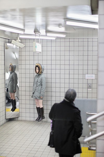
Natsumi Hayashi: Floating
I recently stumbled across a 'floating girl' called Natsumi Hayashi. Hayashi appears to be floating in these photos, making her look weightless in the air.
 Using shutter speed, the photographer is able to take snap shots of Hayashi jumping in the air, creating the illusion of her floating gracefully in mid air. She did not use photoshop or any computer program to create this floating effect. The technique was simple, but the creativeness behind it was exceptional.
 I think Hayashi's photos are very inspirational and interesting. I think she is trying to give people the image of a carefree person who doesn't have anything weighing her down. The pressure from family, work and school acts like gravity. If a person frees herself/himself from all those pressures, would they be able to float like Hayashi in those photos?


I really like the concept behind this idea, because it motivates me to go easier on myself and not let the stress of school and social life tie me down as much. Furthermore, the photographs were taken beautifully. If I had the chance, I would love to attempt these 'floating' photos.

Friday, May 13, 2011
Planking

The person in the picture above is planking. Planking isn't just about lying face down on the ground. There are rules on how to plank properly. First of all, your face must be expressionless while lying face down on the ground. Your whole body must be straight, and your arms must be at your sides. Both your fingers and toes have to be pointed as well.

This "Planking" became a fad in 2011.
I find this quite interesting because it is very unique. Planking captures attention because of the weird display of body. While some people 'plank' for fun, others 'plank' for a more significant purpose. For example, groups of people gather together to 'plank' to complain and protest about certain things. Also, people plank on tourist attraction locations in order to promote their home country. I think using this 'planking' method is brilliant because it certainly captures attention. When people are tired of reasoning and explaining with words, a strange visual display works wonders.

Even though some people 'plank' because they have nothing better to do, others actually incorporated this fad into something useful. I was intrigued by this fad at first, but it loses excitement very soon for me. Although I do think "planking" is a great method to get certain messages across, people will eventually find another trend to follow very soon. Fads like this usually die out pretty soon because human's attention span is short. Once something is overdone, people get sick of whatever fad that was extremely popular very quickly. As each fad pass by, people come up with a new one that is more bizarre and ludicrous to top the old fad. I await for the day when something as ridiculous as wearing shoes as hats become a fad that everyone follows.
Thursday, May 12, 2011
Music Painting
Music Painting by Matteo Negrin.
This video's message was to encourage people to stop global warming. I think it was done quite well because it was simple yet to the point. Without boring us with the statistics of how global warming is ruining our world, this video captures interest because it has the visual component that tells a story. Negrin simplified the cause and effect of global warming to a point where even little kids can understand. Sometimes, simple is best.
I also find it interesting for Negrin to match the background music with the music notes he was drawing in the video. Although it was ironic to use up so many pieces of paper for this video, I do think it was worth it because he is using these sheets pf paper for a meaningful purpose.
Friday, May 6, 2011
East Village Studio


I really like how the designer manipulated the space within the stairs and transformed the useless space into storage spaces. By doing so, the designer was able to maximize the floor plan space.
Thursday, May 5, 2011
Gameboy Color Skin iPhone 4 sticker

I find it interesting covering one of the most advance technology today with one of the oldest. When I first looked at it, I thought it was only a Gamboy Color and reminisced about my childhood. When i realized it was only a skin/sticker, I was quite fascinated because people like myself are often intrigued by something old rather than new. We tend to cling onto the past, even though the past did not have the best technologies or graphics. I guess it is the nostalgic feelings within everyone that attracts them to old technologies like Gameboy Color. We would always say, "I remember I used to love playing that when I was a kid! How nostalgic!". Even though there are new technologies coming out every year, there are always people who deemed their childhood generation had the best creations. In some ways, I think like that as well. We only have the technologies we have today because of the older generation. If gameboys were never created, people would be not able to improve on it and come out with gaming systems like Wii and PSP. If Alexander Graham Bell did not invent the first phone in 1870s, people would not be able to improve it into cell phones like the iPhone. As advanced as we are today, we are only improving on what the past invented.
Friday, April 29, 2011
Postgal: Mum is Born
Postgal Studio's Jason Chan created an animation called Mum is Born for Mother's Day.
This animation talks about a mother of two diagnosed with a sickness and looses her memories, thus the roles of children and mother are switched. In the animation, the daughter has to go to work in order to support the family. She cooks for the family, but the mother merely pushes the food aside and snacks on chocolate and other junk food instead. There are many scenes that showcases the hardships of mothers.
By switching the daughter and mother roles, we are able to experience the everyday life of our moms. It is difficult taking care of children and fulfilling their needs, and it is even harder to adapt to their rebellious ways. I like the concept behind this animation because it tackles the greatness of mothers by letting us, the viewers, see and experience the mother's perspective. Raising children is difficult and frustrating, but mothers will not quit no matter what because they love their children. This animation serves as a reminder for us to appreciate our mothers, because they are the greatest people on Earth.
Other than the concept, I really love the background of this animation. I have always been keeping an eye on the productions of Postgal because of their illustration styles. I like the loose lines and water colour effect in the background because it's attractive, yet simple enough so it won't steal any attention away from the animation characters.
I also like the fact that they did not incorporate audio for the characters and used speech bubbles instead. That way, the audio will not distract the viewers so they can focus on the animation.
Thursday, April 28, 2011
Xaver Xylophon: Joy of Destruction
http://vimeo.com/13867736
Above is a stop motion animation video by Xaver Xylophon.
As the title is pretty much self explanatory, this video was made purely on the concept of the joy of destruction. I have always been intrigued at stop motion videos, but this video had the perfect timing and perfect images.
I like the concept itself behind this animation, because I agree with it to certain extents. No matter how good-natured anyone is, we are only human. Sometimes, we feel good destroying things. Destruction doesn't have to be physical, it can be emotional as well.
Like at 0:30 to 0:33, the girl destroyed the boy's fantasy of Santa Claus and it made her feel good. It may sound evil or plain horrible, but people get enjoyment out of destruction in their own way. Also, people get satisfaction by destroying something they hate. For example, I felt relieved and happy when I ripped my chemistry notes into pieces.
It is the joy of destruction that makes us human. It is this enjoyment that created the world and the events that effects it, may it be in a bad or good way, although most of the time that enjoyment represents the worst in society. Even if someone denies it, there is certainly a part of him/her that enjoys destroying.
I think the stop motion technique was well equipped into this concept with excellent timing. The artist used different materials to create this animation: cutouts, video, photos. In a way, I think the cut outs worked best in the animation because they portrayed and reenact certain destructions that could not be done again.
Friday, April 22, 2011
Going West
Going West is a stop motion animation that focuses on book-paper craft done by the Anderson M Studio.
The idea behind this animation is 'When books come to life'. I think this concept was really well adapted into the animation. Every words of a book tells a story, and every story creates a mental image in one's head. This animation perfectly portrays that concept by slowly building up every detail of the book as the narrator's words continued. The details and structures of every second in this animation tells me how much effort and time were put into this video. The animation shows that words on a two dimensional piece of paper can create wonders through imagination.
Lately, I have been interested in paper crafts, so I was immediately drawn into this video when I stumbled across it today.
I think what worked the most for me in this animation, is the shadows. The shadows created depth and solidified the three dimensional objects. It made everything seem more real and tangible. Also, the way it was filmed made the animation effective. For example, between 1:36 - 1:46, the shadows casting under the structures moved according to the narrator's words, and the screen zoomed in according to the beat and tone of the voice as well. I think that was really well done because it pulls the watcher's attention and creates the mood in the story.
Wednesday, April 20, 2011
Ai Wei Wei: Sunflower Seeds


By filling the hall with these sculpted seeds and having people walk all over them is also a clever concept. I think Ai Wei Wei is telling people that these amazing crafters/artists in China are often neglected and their works are being stepped on ruthlessly. Even if there are hundreds of people who are skilled and talented, it doesn't mean that they are normal amongst each other. I think every artist should be acknowledged for their skills, no matter how vast the industry is.
Friday, April 15, 2011
Ōoku

The main character, Mizuno, enters Ōoku in order to bring in money for his family. Ōoku is the harem of Edo Castle, where the reigning commander lives.
I just finished watching this movie, and I was quite intrigued by the concept. In the daily life of Japan, women does all the work that men are suppose to do. For example, the women in this movie are construction workers, controls and reign the government of Japan and does what men would typically do. Men on the other hand, take on easier jobs. They take on roles similar to prostitutes as well, being showcased in a box for women to drool over. Some of them even 'lend out their bodies' to women to fulfil their wishes of getting pregnant since there are so few men left, getting married is almost impossible for common women.
In Ōoku, there are more than 3000 men servants serving the woman commander that reigns Japan. When Mizuno enters Ōoku, he thought life would be easier. What he did not expect was the world within this forbidden place to be full of dark secrets and deception.
I find this movie really interesting because even if the gender roles are switched, the common problems and ugliness still exists in the roles they adapt into.
For men, who are the minor and weaker gender, taking on jobs similar to prostitution is no different than women in real life doing the same thing. By switching their genders and the whole world around them, it made me think that the real society might be biased towards women. In the real world, people frown upon prostitution (which is mostly directed towards women), but it is normal in the movie where men are displayed for women to drool over and even lend out bodies just so they can have a chance of getting pregnant. In fact, such actions are deemed normal in this movie, unlike in the real world where prostitution is illegal and considered a sin.
I have seen a lot of olden time dramas that focuses on the lies and tricks women use to get higher status, or just to please the king. People often think that women are all evil inside, capable of such schemes. In the movie, men are exactly like that too. They used their beauty and intelligence to achieve higher ranks, to scheme against people who might threaten their place in Ōoku.
On the other hand, women in this movie work in construction sites, moving heavy materials by themselves and does everyday labor men usually do in the real world. All these scenes made me realize that women can do whatever men can. When the society pushes you and you have no other choice, anyone is capable of anything. Gender isn`t an issue at all, it does not hinder one`s will or power.
Here is a trailor:
Wednesday, April 13, 2011
Peter Dahmen: Pop-Up Paper Sculpture
In this video, Peter Dahmen showcased six different pop-up paper sculptures.
I have always been fond and interested in origami and paper art, therefore I was instantly astonished when I found this video. I was amazed by how a simple piece of paper can be made into something so detailed. The distortion of paper made by cutting and folding, turns smooth, textureless papers into something three dimensional. As seen in the video, textures can be made depending on the fold of paper, creating different effects and depth. The shadows in between each fold also creates negative spaces that help define the structure. I actually followed a tutorial and made a pop-up paper sculpture, like the second last structure shown in the video. It was a simple one, therefore it wasn`t hard to follow.
What amazed me was that I was able to create a structure that seems very complicated out of a simple, flat sheet of paper. This made me realize that some of the greatest inventions are made or originate from the simplest things that people often neglect. It encouraged me to create.
Furthermore, the finished creation of this pop-up paper sculpture looks nothing out of the ordinary when I closed it in half. It just looks like a normal folded piece of paper, and you would probably think nothing of it. If you do pass it by, you would miss something amazing inside the folded piece of paper. Beauty is often left undiscovered because people don`t bother looking underneath an uninteresting surface.
Saturday, April 9, 2011
Freeter, Ie o Kau

This drama talks about the life of Take Seiji, who quits his job after three months because of his manager`s biased-attitude. After quitting his job, he cannot find himself another job because his job reputation was ruined. His father is cold towards him, calling him useless and pathetic because he cannot endure the reality of life. With no job, no money and no dream, Seiji becomes an unenthusiastic freeter. A freeter is a term in Japan that means `part-timer`. Just when Seiji was about to give up on life, his mother falls into depression due to the neighbour`s constant bullying. He then was reminded of his mother`s kindness and love even when he was giving up on everything, thus motivated him to buy a house so his mother will no longer suffer the harsh behaviors committed by their neighbours. Even if he is just a freeter, he wants to be able to buy a house with his own abilities for the sake of his family. Not only does this drama focusses on Seiji`s life, it also outlines the problems of everyday housewives and the dreams of teenagers.
I quite like this drama, because it is real. It touches on the reality of life, and the cruel parts of society. This drama does not sugar coat anything, which is something I prefer because I can learn from it. I can relate back to the main character, Seiji, because I too, am a person who gives up easily and is often unmotivated. Seiji found the motivation through the most important person to him in the world, his mother. I find this precious because it is very hard to discover someone, or something that keeps you going no matter how bad the circumstances are. Like Seiji in the beginning of the drama, I am lost as well. I do wish to find something or someone to motivate me soon.
There isn`t a striking climax to this drama, but the plot and emotions will keep you watching. I guess it is the reality factor in it that everyone can relate to that makes this drama interesting. It is the ordinariness that attracts people, and it is very touching. This drama is one of my favourite, and one of the best dramas I`ve watched.
Friday, April 8, 2011
Tara Donovan: CupArt

Saturday, April 2, 2011
Mini: Two of Us
In this music video, the artist Mini took videos and pictures of real couples. I really like the way how the videos and pictures were edited to fit into the music video, kind of like a stop motion. Instead of hiring actors to act out romantic relationships that everyone dreams of having, they filmed and took pictures of real couples. I think this is really a good idea because it illustrates something from reality, a relationship that can is tangible. The couples in this music video are not exactly good looking, which adds to the whole reality factor. Not everyone can find a girlfriend that is as beautiful as the actresses you see on television, nor can you live out the ideal relationship portrayed on dramas. I really like how real this music video is, and yet I can feel the love radiating from each gestures. Even without the handsome faces of the guy and the flawless skins of the girl, you can still find happiness in reality. This video widens the eyes of girls whose standards are too high, giving them comfort that happiness can be found outside of dramas and fairytales.
Friday, April 1, 2011
Kyle Bean: Cell Phone Paper Craft

Bean actually made a video about his final products, which better portrays the size different betwen each cell phones by fitting one into another.
I like the concept of this because it makes me think about the evolution of technology throughout time. Even though the photograph only show the size difference, you can imagine the functions of each cell phone getting better and better. While the size decreases, the abilities inceases. Looking at the photraph made me really think how great humans are. The advancement of technology had been improving expotentially, but what will happen when you can't improve anymore?
At the end of the line of cell phone is an iPhone. Will someone come up with a cell phone that is smaller than that? Will there be a day when a cell phone is the size of your thumb? What will humans do when they can't improve anymore? In my opinion, humans are too focussed on improving at they already have. Because of that, they will be at lost when the time comes where everything will be so advanced and perfect that there are no flaws to fix. People will start losing jobs and the need of improving will leave them hanging. I'm not opposing the advancement of technology, but I think it will be better for humans not to be too dependent on the improvement of technology.
Friday, March 25, 2011
Obesity and the Brain

I really like how Gray constructed this sculpture to the smallest details like the tiles on a bathroom floor to make this whole artwork complete. The shadows in between each object shows placement, adding a certain depth to the whole photograph.
The concept of this photograph is also very important. I love how Gray conveyed the message through this piece pf artwork, because it works and gets people thinking. I think that Gray is trying to tell people the brains of a person is more important than their appearance. It is inner beauty verses outer beauty, and inner beauty always outweighs the latter. Placing the brain on a scale and have it break the device symbolizes the concept of 'brains outweigh appearance'. I like how one photograph conveys such an important believe, creating the effect of 'one picture is worth a thousand words'. Sometimes it's much easier to create a piece of artwork to convey a message rather than write a whole essay.
Wednesday, March 23, 2011
SagiPuri

Purikura comes from the word Purinto Kurabu (Print club). This Purikura is basically a photo booth or photo sticker booth, a machine that is popular among Asia, especially Japan. In SagiPuri, Sagi means 'to trick' or 'a fraud'. This SagiPuro machine is also a photo booth, but it has a function that manipulates faces to trick people. After you take a picture from the SagiPuri, you will not look like yourself, therefore tricking people with a photo that does not resemble you at all.
In a SagiPuri, the machine targets your eyes and automatically make them bigger through the photo. If you can find the correct angle, the machine also slims down your chin to make you look skinnier. After they manipulate and alter your face, you will most likely look different. By making your eyes extremely big and slimming down your chin, you can then trick people with this photo you took from a SagiPuri.
I think the Japanese are really creative for coming up with such an idea, but I also think that this concept is leading more people into the stereotypical subject where 'Asians have small eyes'. With all those new inventions like SagiPuri and circle lenses to trick people into thinking one has big eyes, people will be constantly reminded that 'Asians have small eyes', so that is why we have so many inventions to make our eyes seem bigger.
In my opinion, this machine manipulates too much with one's eyes. I admit that some people will look better with the effects of SagiPuri, but I've seen photos were people look absolutely freaky in their SagiPuri photos. Truth is, people who have big eyes originally will look disgusting in SagiPuri photos. Sometimes, going with your natural look will be better.
Example of which the effects will make a person look kind of disgusting or alien-like:


Saturday, March 12, 2011
Miriam Sweeney: Subversion

I stumbled upon this amazing photograph when I was on the Internet. I instantly fell in love with the excitement and beauty of this photograph.
To me, this photograph captured the exact moment when the horse is entering a different dimension. This kind of reminds me of a fantasy moment when one crosses from reality to the dream world.
The title of this work is Subversion, which led me into thinking that the horse brings destructive upon a peaceful world. Once the horse crosses into a different dimension, destruction will dawn upon the world. Since the background is of pure white and the horse is black, the horse might act as a symbol for destruction. In this photograph, Sweeney stopped time and captured the horse's movement, showcasing moment before destruction happens. I really like how the black and white contrast with each other to emphasize the horse. The shadows give out the vague form of the horse, foreshadowing that destruction is near.
Thursday, March 10, 2011
Postgal

The producer and main designer of this workshop, John Chan, bases his animation on the common problems among society that tend to be ignored. In order to get the citizens' attention, the designer incorporated characters from an old time anime that people in Hong Kong grew up with. Doreamon.
If you grew up in Hong Kong or Asia, Doreamon is an anime that you are familiar with. Chan even went through the trouble and used the voice actors that dubbed Doreamon to voice act in his animations.
By using familiar characters that Hong Kong people know and love, the designer successfully captured interest. When you put a retro design out there, people will go "Oh! It's Doreamon! I used to watch it when I was a kid!". But since the characters are technically just a spin off of Doreamon, people will stop and wonder about this spin off animation. They will unconsciously pay attention to the contents of the animation.
In most of Postgal's animation, they address the recycling problem. Since people tend to have a hard time accepting new things, Chan made a bold and intelligent decision to reuse and renew retro designs to get his message across. I have watched a few of their animations, and each of those videos inspired and intrigued me. I really like the illustrations incorporated in the animation and the overall style.
An example of Postgal's animation:
This video demonstrate how the power of recycling can help you save money.
Saturday, March 5, 2011
Rhinoceros Horn

Date: December 13, 2010
Realised Price: $893750
Size: 12.2cm x 15.5cm
I remember watching the news a few months ago, reporting about a rhinoceros horn sold at a auction house for almost 900k. The story behind this rhinoceros horn is rather interesting. The women who sold this horn actually bought it at a yard sale for $1 in the 80s. At that time, she didn't think much of this rhinoceros horn other than a beautifully carved object. This rhinoceros horn had been collecting dust at the woman's home ever since. Until the day her husband died and she needed money for his funeral, the women was forced to sell this rhinoceros horn. She never imagined it was actually a rare artifact that has a potential price between 400k - 600k. I find interesting because the saying "One man's trash is another man's treasure" fits perfectly in this situation. It's really how a person view things in their own perspective. The person who sold it at the yard sale obviously didn't think much of this 900k valued rhinoceros horn, neither did the women who bought it for $1. If the women did not auction this horn, its true beauty would have never had a chance to get recognition. Sometimes, I wonder how many priceless artwork like this horn is buried under a pile of junk.
Source: http://asianart.waddingtons.ca/13december2010/catalogue/320/0355/
Friday, March 4, 2011
Deco Den

Above is a picture of a deco den DS case. "Deco" means decoration, and "den" comes from an abriviation Japenese word that means phone. At first, the Japanese started to decorate their cell phones with charms and rhinestones. Later, this idea was popular enough to escalate into more than just cell phones. People do 'deco-den' to their jewelery boxes, mirrors and like the photo above, DS cases.
When I first looked at the photo, my first thought was: Wouldn't it be troublesome when you actually play the DS?
With all the ice cream charms and biscuits sticking out, it would surely affect the gaming process. People are well aware of that, but they still insist on decorating their DS cases like the one in the photo above. My teacher once told me that girls typically like aesthetically beautiful, but useless objects. Even though it is a stereotypical thing to say, I do agree with her to some extend. Like myself, I have a turtle wallet, stuffed animals on my bed and a whole box full of bead-charms. I can buy a normal looking wallet, but I chose to buy a turtle one that cost more. The stuffed animals and bead-charms are totally useless, but I have them because they look "cute".
I am fascinated by why girls usually like aesthetically beautiful, yet useless objects. Even though I am the same, though not as extreme as some girls, I still can't quite understand why I buy the things I do.
Picture from: http://www.facebook.com/photo.php?fbid=301760735882&set=a.301756500882.197968.72429330882
Saturday, February 26, 2011
Eason Chan: 一絲不掛
Below is the music video of Hong Kong singer Eason Chan's 一絲不掛
When I first saw this video, I was quite impressed by the idea of sand animation. It was my first time watching sand coming in a form of art, and I was very intrigue by it.
First of all, the title of this song translates into "No Strings Attached". The lyrics explain a broken relationship between a man and a woman and how the man is still bounded by their memories while the woman has already moved on. Throughout this video, 海潮, the sand animator, manipulates the sand to dance around Chan. The sand forms and changes to depict the scenery described in the lyrics, also demonstrating the relationship between the man, who is being controlled, and the woman, who controls the man even after their relationship has ended. The sand animator's hands play the role of the woman, the one who controls Chan's emotions and love. As seen in the video, Chan is being played around within the hands of the sand animator.
Towards the end of the video, Chan stood up and rid himself of confusion and struggles. He left the frame of sand, which symbolizes cutting the strings that were attached to him and his previous relationship off as he walked away without looking back. This, I believe one of the most conceptual point in this video as it relates back to the title of the song: No Strings Attached.
I was inspired by this music video because of the sand animation and how it perfectly fits into the song. The sand animator played an important role to portray the lyrics of this song. Although I had some difficulties understanding the sand animation at first, I liked how everything wasn't straight to the point. The slight confusion of the sand animation allows the viewers to depict what the scenery means, which catches attention and hooks interests.
Title: 一絲不掛 (No Strings Attached)
Lyrics: Albert Leung
Arranged by: Gary Tong
Producer: Alvin Leong
Sand Animator: 海潮
Friday, February 25, 2011
ARASHI: Troublemaker
Below is a music video of the song "Troublemaker" by ARASHI.
http://www.tudou.com/programs/view/XQ3OvJEctsw/
This song is the third best selling single of 2010 in Japan. It was released on March 3rd, 2010 by the record label JStorm. I really like this music video not only because it has a catchy chorus, but also because of the video itself. It incorporated stop motion as the main selling point, which gives the viewers a fresh experience in music videos.
In this video, the song and visual images come together perfectly as they both follow a cheerful theme. The stop motion was done quite well, and I can tell that a lot of time and effort was put into this video. Furthermore, the rhythm of the stop motion also corresponds with the beat of the song. For example, between 00:09 to 00:26, the orange juice, apple and lettus all change in sizes according to the beat of the intro. For the juice, pictures were taken of the glass with different amount of juice. The editors then put the pictures together using the stop motion technique, creating an image of a glass of orange juice acting like volume levels of a stereo.
Although stop motion is the focal point of this music video, de-familiarization is another interesting point here. Using de-familiarization, inanimate objects are able to come to life. For example, a town built with toys in 1:47 to 1: 49 is put together as if the toy cars and people are actually moving.
I have also watched the 'making of' of this music video. The pictures of this video were taken in front of a green screen, which allowed the editors to add other features to the music video easily. Since this is a music video, the director of this video also thought about incorporating stop motion with the lyrics of the song. The Japanese language mostly consists of the sounds: A E I O U. The director took pictures of ARASHI as they mouthed the sounds of those five sounds. When the pictures are put together in stop motion, you can see that shape of their lips actually match the sound of the song. (See 2:25 to 2:27)
I like how this music video has a different approach than typical music videos. They way their incorporated stop motion and de-familiarization allows viewers to depict everything in a different point of view, which is a very good selling point.
Source: http://www.j-storm.co.jp/arashi/disco/single/s_23.html
Subscribe to:
Comments (Atom)